Justified layouts on invitations
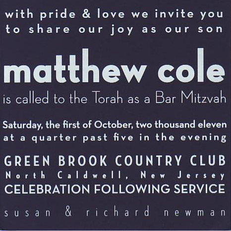
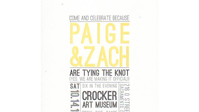
A recent trend in invitation printing is the use of justified copy. Text on each line is set both flush left and flush right, so that the resulting block of copy is as much of a design as an invitation. It can be very tricky to set copy this way since the natural length of each line varies. Type can be tracked out to stretch a line, or letters can be narrowed or condensed to keep the margins consistent. Typography designers spend hours figuring out the best way to place each letter and space.
This trend is visually striking, and eliminates the need to add decorative borders or any kind of artwork that is not type based. The feel is contemporary and clean, rather than busy or cluttered. Using two ink colors and having the important lines, such as names and dates, stand out makes layout really “sing”.
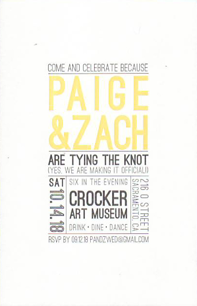
Birthday invitations, Wedding Save the Dates, Rehearsal Dinner and Bar and Bat Mitzvah Invitations are the usual suspects in the world of justified copy.
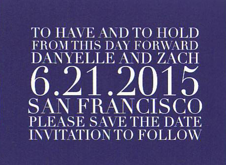
The best way to achieve your desired layout is to look at many samples and play with your text in a document file, so you can determine which lines need shortening or manipulation. It may take some work and a trained eye, but in the end you might achieve invitation nirvana!
